
Animated captions do more than make a video accessible: they give the eye something to follow. Highlighting each word as it's spoken keeps attention on the screen, makes fast speech easier to follow, and turns captions into part of your visual style.
This guide builds on how to add readable captions. Readability comes first; animation is what you add on top.
How word-by-word captions work
- The speech is transcribed with timing for every word. Each word knows exactly when it starts and ends.
- The text is split into short lines. Two or three words at a time is typical for a vertical frame.
- The current word is highlighted. A color change, a background card, an underline, or a small scale-up marks the word being spoken.
When the timing is right, the highlight lands exactly as each word is said, and viewers read along without effort.
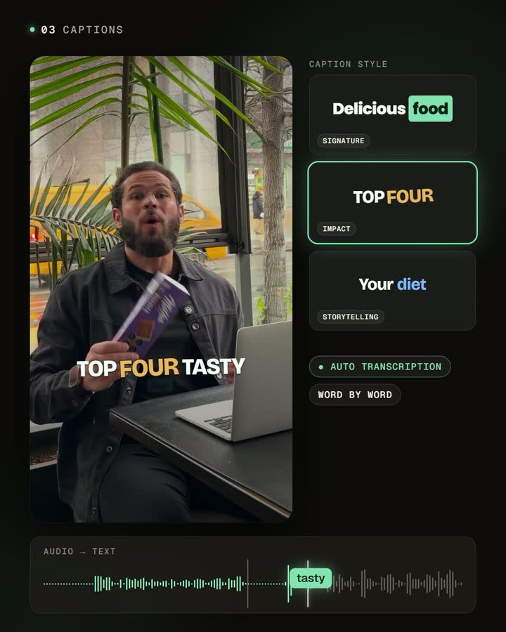
Pick a style for the message
- Bold highlight card: a colored block behind the current word. Strong and readable; works for most talking-head videos.
- Color change only: the active word changes color. Calmer, good for storytelling and longer explanations.
- Big and punchy: uppercase text, a thick outline, and a pop on each word. Use it for energetic, list-style videos.
- Underline: a line under the current word. Subtle, good for educational content.
Make it yours
A recognizable caption style works like a logo: viewers know it's you before they hear your voice. Customize:
- Font and weight: one heavy, highly readable font beats a decorative one.
- Colors: use your brand color for the highlight and keep the base text light, with an outline or shadow.
- Highlight type: card, color, or underline, matched to your tone.
- Position and size: large enough to read at arm's length, small enough to keep your face clear.
- Animation: how words enter and how the highlight moves.
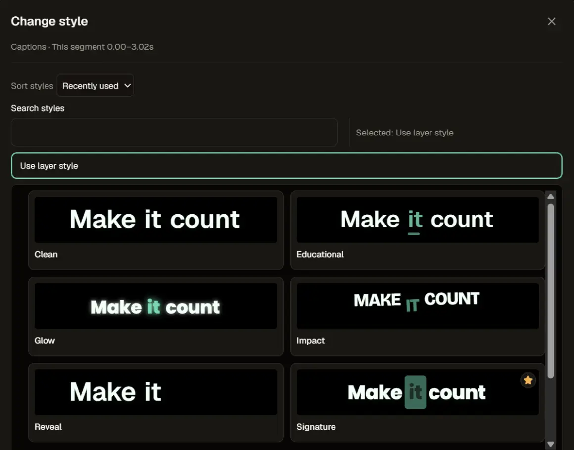
Placement on a vertical frame
- Keep captions in the middle band. The top and bottom of the screen are covered by app buttons, usernames, and descriptions.
- Never cover the face. Place captions below the chin, not across the mouth.
- Keep lines short. One or two lines at a time; long paragraphs can't be read at speed.
Mistakes that make captions harder to read
- Too many words per line. Viewers lose the highlight.
- Low contrast. Light text on a bright background disappears without an outline or shadow.
- Over-animation. Bouncing every word competes with what you're saying.
- Unchecked text. A misspelled name looks careless in large animated type. Proofread the transcript.
Frequently asked questions
Are animated captions accessible?
They help viewers who watch without sound, as long as the text stays accurate and readable. Avoid effects that make words hard to read.
Do they work in any language?
Yes. Captions follow the language you speak.
How many words should be on screen at once?
Usually two to four. Fewer words per line make the highlight easier to follow.
Can I use different styles for different videos?
Yes. Save a few styles and match them to the tone of each video.
Style your next video
Pick one base style, set your brand color as the highlight, check placement on a phone, and use it consistently for a few weeks. Consistency is what makes a style recognizable.


